Accessibility in web design: issues & checklists
Accessibility (availability) is an important part of web design, as it provides more needs of people with special abilities who can use your website. Especially for those who have different types of disabilities or physical limitations that may make it difficult for them to use the website. And while the most common form of disability is visual, audio, and motor limitations, there are many others, including low literacy or understanding of a foreign language, which can make a website inaccessible to a user.
In general, considering accessibility issues in web design is important because it allows websites to be more accessible to different categories of users. It also has a positive effect on the reputation of the companies that care about their users and create accessible websites. Besides, taking accessibility into account increases the effectiveness of a website because more users can interact with the site, get information and buy products, which can lead to increased conversions and profits. It's also worth remembering that not paying enough attention to accessibility issues can lead to legal problems, as some countries have legal requirements to make websites accessible to people with disabilities. For example, in the US, the Americans with Disabilities Act (ADA) requires websites to be accessible to all users, including people with disabilities.
To begin with, I would like to describe the main problems with the accessibility of websites that we encounter very often on the Internet:
- Inaccessible or not sufficiently navigable website structure. For example, no alt text descriptions for images, unclear placement of web element IDs, no focus element definition, etc.
- Unintelligible information on the website. For example, lack of textual descriptions of audio and video content, font size that is too small, use of color palettes that do not provide sufficient contrast.
- Insufficient interactivity with the website. For example, missing or insufficiently sized buttons to click, missing or insufficiently sized input field, unclear placement of interactive elements, etc.
- Insufficient support or complete lack of assistive technologies. For example, not being able to use keyboard controls, not being able to change the font size or other visual settings.
I would also like to recommend a small checklist with the main points that should be paid attention to when creating websites accessible to all users:
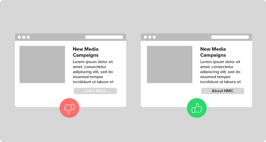
Use clear names for links and buttons
Names of links and buttons should be easy to understand, with descriptions and they should not hide the essence of their action. For example, instead of using a button that says "Click here," it's better to use "Learn more about this product."
Use colors with appropriate color contrast
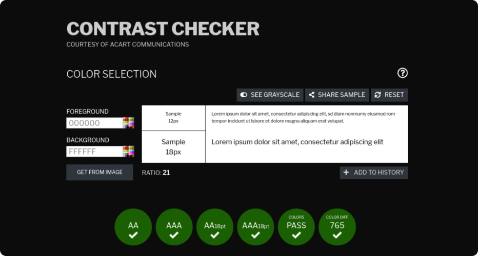
(ISO-9241-3) and (ANSI-HFES-100-1988) 3:1 are recommended by worldwide standards. There are many tools with which you can easily check color contrast. Colors should have sufficient contrast so that users with different types of disabilities (especially visual) can easily distinguish different elements of the design.
Read also: The role of UX/UI Design in The Development of Mobile Applications
Add the ability to change the font size
The ability to change the font size on a website will make it more accessible to users with poor vision.
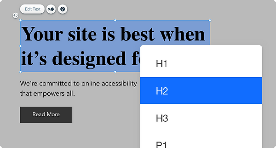
Use descriptive headings
Headlines should be short, to the point, and should describe a specific page or activity to give users an idea of what information they will find on the page.
Use alt text for images
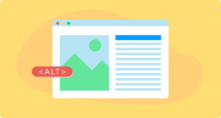
Alternative text for images (alt-text) is a text description of an image that is used when the image cannot be loaded or when the user has vision problems and uses screen readers. This allows all users to access the context of the image.
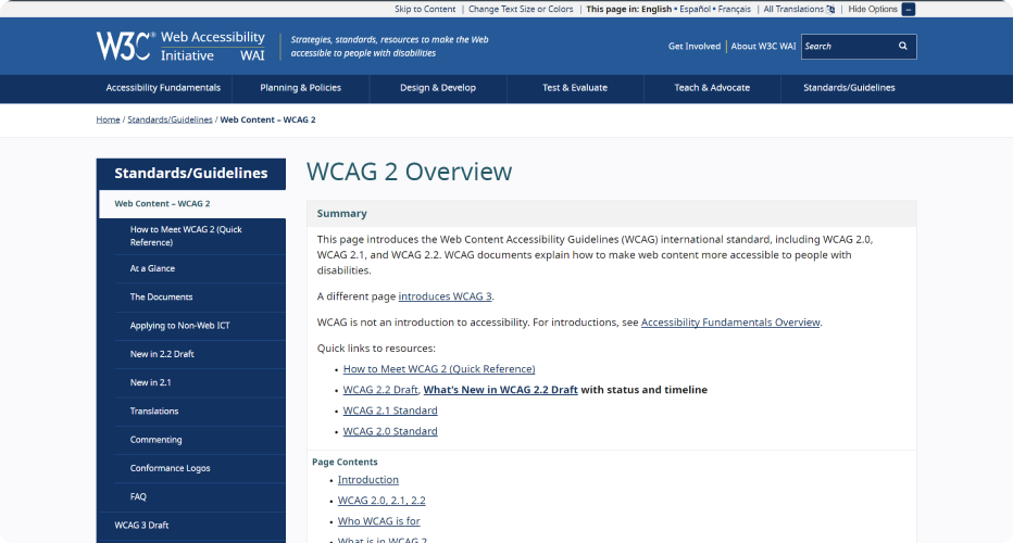
Comply with web accessibility standards
The Web Accessibility Certification (WCAG) provides standards and guidelines for making websites more accessible. Adhering to these standards will help ensure that your website is accessible to all users.
Check your website for availability
Testing your website for accessibility is an important part of the development process. There are special tools, such as WAVE or Lighthouse, that will help you identify possible problems with the accessibility of your website.

In general, web design should be created considering needs of users with different types of disabilities and physical limitations, in order to provide them with the highest possible level of accessibility. Following these important points will help make your website more accessible to all users and provide them with a comfortable and pleasant interaction with it.
In my previous article, I described 10 Nielsen heuristics that you or your team can use to build a user-friendly and accessible website.
Software Development Hub is a team of like-minded people with broad experience in software development, web engineering and mobile engineering. We provide clients with a full comprehensive custom development cycle, including architecture planning, business analysis for clients, UI/UX design, quality control, project management and support.
Categories
Share
Need a project estimate?
Drop us a line, and we provide you with a qualified consultation.


